Establishing a Unified Design Language and Reusable Components at greytHR
.png)
Goals
Background and Goals
As Design Lead at greytHR, I identified the need for a consistent design language amid our rapid growth and expansion. I spearheaded the creation of the New Design System, a solution designed to deliver visually cohesive and user-friendly experiences across all our products and services.
- Establishing a Unified Design Language: Create a consistent design language to serve as the foundation for all products, reflecting our brand identity and enhancing usability.
- Creating Reusable Components: Develop a design system using a single tech stack to ensure consistency across different products and avoid technical debt.
- Introducing Concepts and Guidelines for Component Reusability: Define guidelines to ensure components and their variants are reusable, promoting efficiency and consistency.
Objective 1
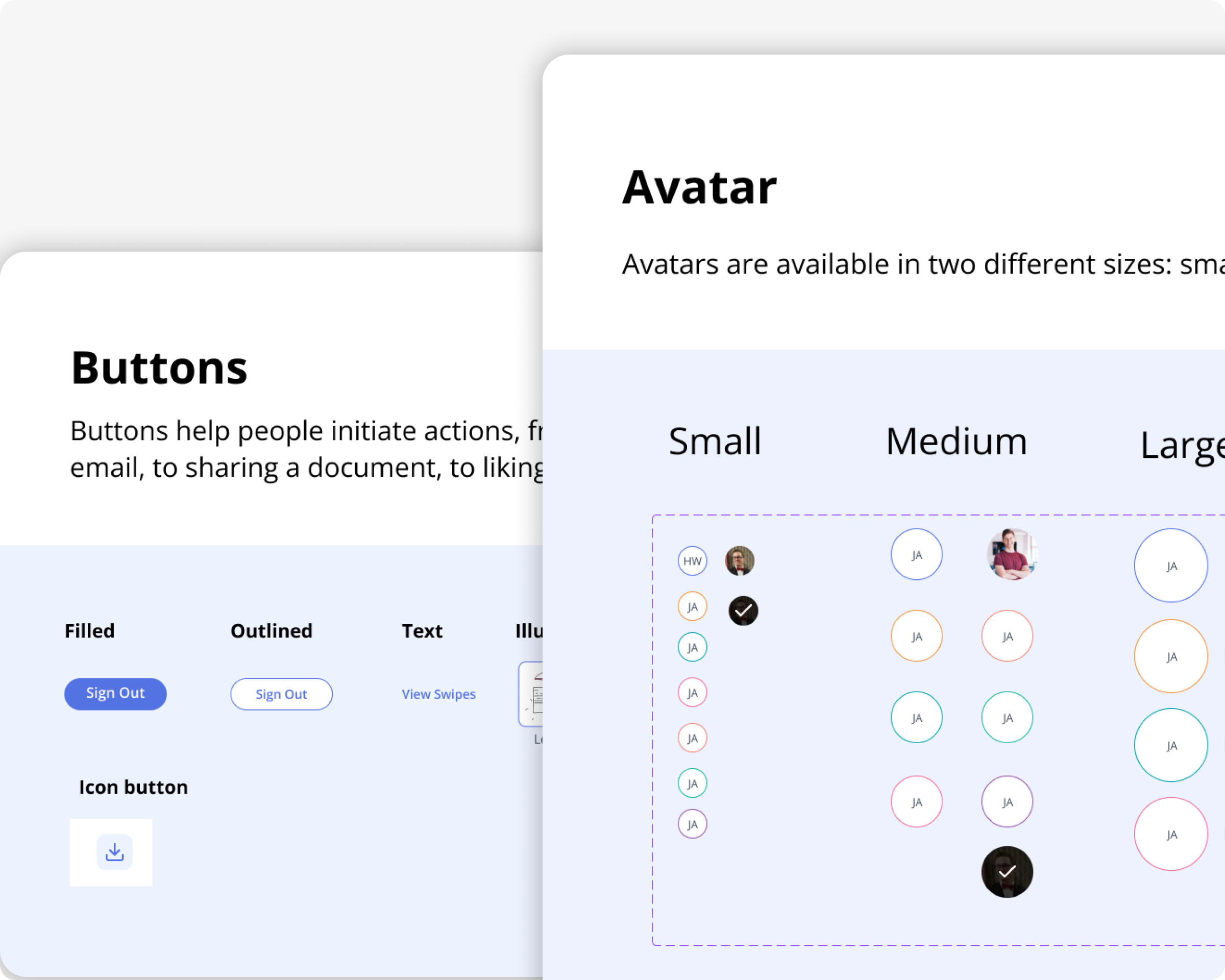
1. Establishing a Unified Design Language

Objective
To create a unified design language that would provide a cohesive visual and interaction experience across all greytHR products. This involved defining design tokens and setting up an atomic design system that aligns with our brand identity.
Approach
- Research and Analysis: Conducted thorough research into our current design inconsistencies and analyzed user feedback
- Design Tokens Definition: Defined fundamental design tokens including colors, typography, spacing, and shadows to ensure consistency.
- Atomic Design System: Implemented an atomic design system comprising atoms (basic elements like buttons and inputs), molecules (combinations of atoms), organisms (complex UI components), templates, and pages
Process
- Brand Alignment: Collaborated with the branding team to ensure the design language accurately reflects our brand identity.
- Prototyping and Testing: Created prototypes to test the design language across different products and gathered user feedback.
- Documentation: Developed comprehensive documentation outlining the design tokens and their usage.
Outcome
- Consistency: Achieved a unified look and feel across all products, enhancing user experience.
- Efficiency: Improved design and development efficiency by reducing redundancy and creating reusable design tokens.
Objective 2
2. Creating Reusable Components
Objective
To create a design system that is consistent across all products, using a single tech stack to prevent technical debt and streamline the development process.
Approach
- Technology Assessment: Evaluated the existing tech stacks and identified the best fit for a unified design system.
- Component Library Development: Built a library of reusable components that adhere to the design tokens and atomic design principles.
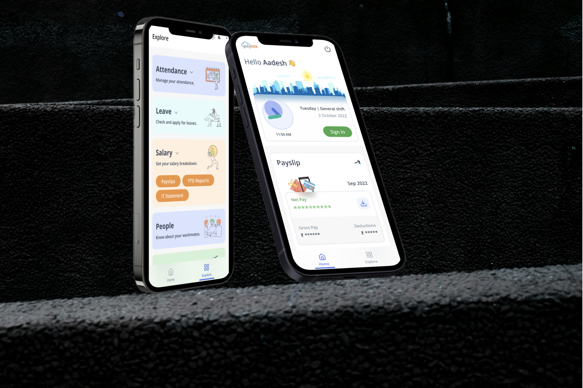
- Cross-Platform Consistency: Ensured the components are consistent across different platforms (web, mobile, etc.)
Functional CSS vs. Class-Based CSS
Functional CSS and class-based CSS represent two different approaches to styling reusable components, each with its own strengths and challenges. Functional CSS, like Tailwind CSS, enables rapid development through predefined utility classes, ensuring consistency and flexibility but can result in cluttered HTML and a steep learning curve.
On the other hand, class-based CSS promotes readable and maintainable code with better style encapsulation, though it may lead to complexity, duplication, and scalability issues. Choosing between them depends on the project's needs, balancing speed and flexibility with readability and maintainability.
Implementation
- Tech Stack Selection: Based on our evaluation, we chose a combination of functional CSS (using Tailwind CSS) and class-based CSS for optimal flexibility and maintainability.
- Component Design: Designed components with a mix of utility classes for common styles and semantic class names for complex styles.
- Collaboration with Engineering: Ensured seamless integration of CSS approaches into the development workflow.
- Testing and Iteration: Conducted rigorous testing to ensure components function correctly across platforms and iteratively improved based on feedback.
Outcome
- Consistency Across Products: Achieved a uniform design across all greytHR products.
- Reduced Technical Debt: Minimized the risk of technical debt by using a single tech stack and reusable components.
- Flexibility and Maintainability: Balanced flexibility and maintainability by combining functional and class-based CSS approaches.
Objective 3
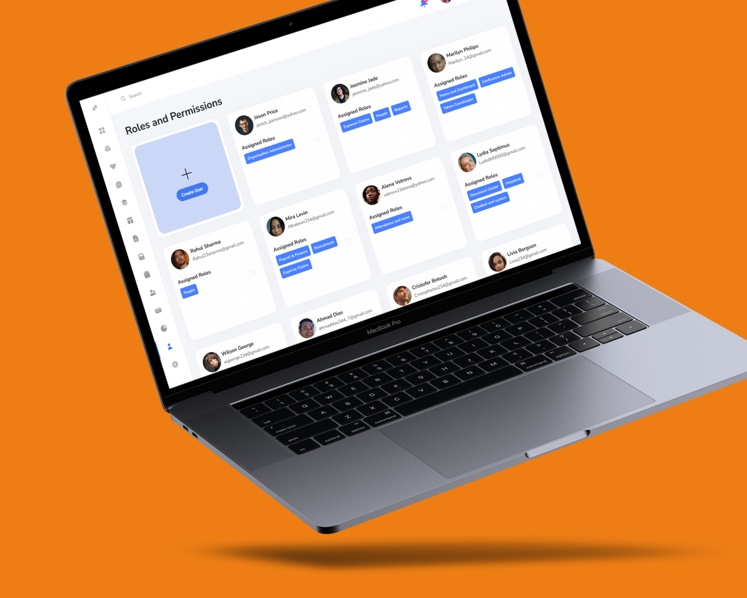
3. Introducing Concepts and Guidelines for Component Reusability
.png)
Objective
To define and introduce guidelines for component and variant reusability, ensuring a scalable and maintainable design system.
Approach
- Guideline Development: Developed clear guidelines for creating and using components and their variants.
- Training and Onboarding: Provided training sessions for designers and developers to ensure adherence to the guidelines.
- Documentation: Created detailed documentation outlining the best practices for component reusability.
Process
- Guideline Creation: Defined guidelines for component naming conventions, variant creation, and usage.
- Workshops and Training: Conducted workshops to introduce the guidelines and best practices to the team.
- Continuous Improvement: Established a feedback loop to continuously improve the guidelines based on user and developer feedback.
Outcome
- Scalability: Enabled the design system to scale efficiently with new products and features.
- Maintainability: Improved the maintainability of the design system by promoting reusable components and clear guidelines.
Key takeaways & learning
Conclusion
- Collaboration is Crucial: Successful design system implementation requires close collaboration between design, development, and branding teams.
- User-Centric Approach: Regular user testing and feedback are essential to ensure the design system meets user needs.
- Continuous Improvement: A design system is a living entity that needs continuous updates and improvements based on feedback and technological advancements.

