Redefining greytHR Mobile
.jpg)
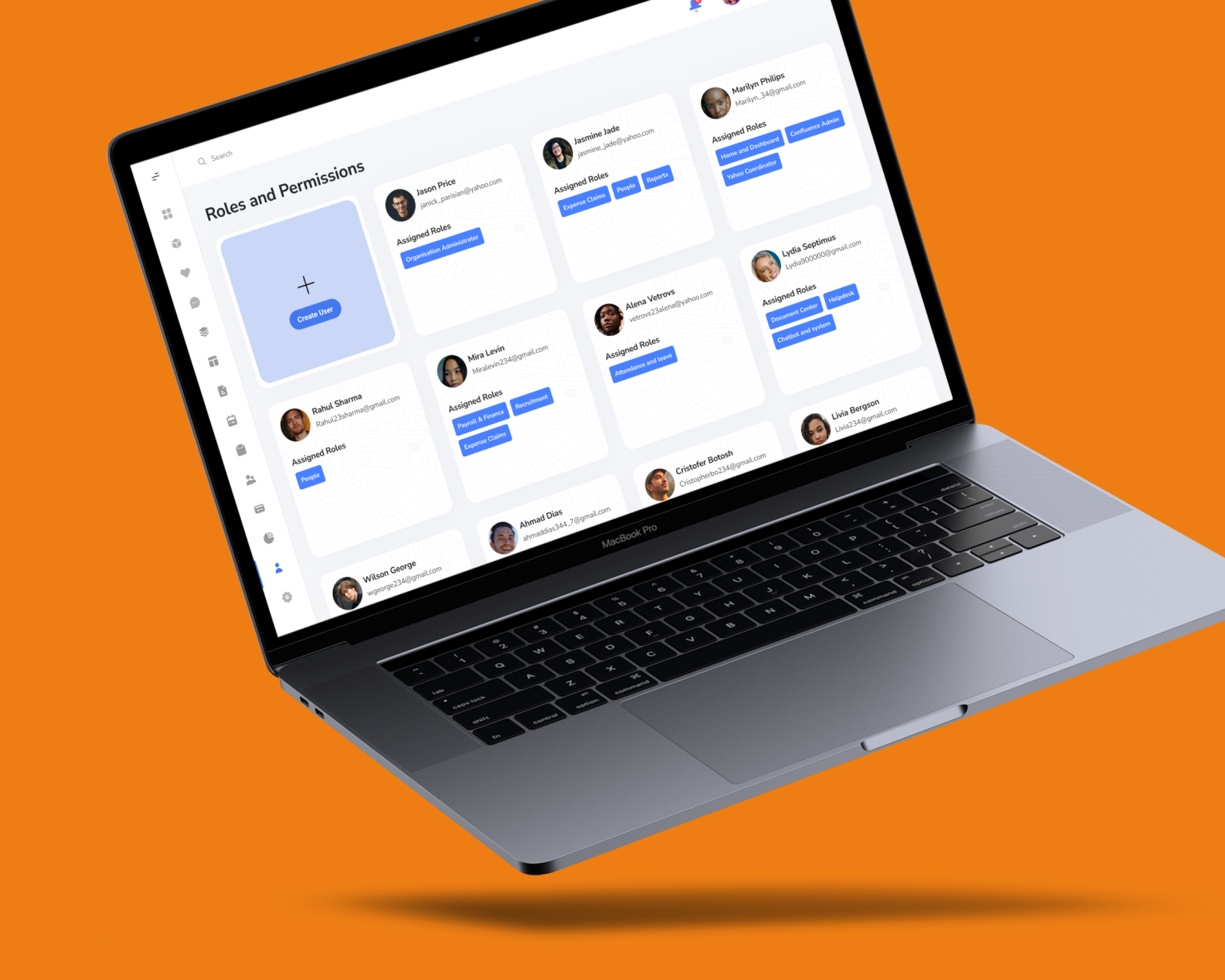
Background
The Problem
greytHR was experiencing low user engagement due to a cluttered interface and uninspired design. This resulted in a negative user experience and limited brand impact.
Solution 🪄
We conducted a thorough user research process to understand user needs and preferences. Based on the findings, a user-centric redesign was implemented, prioritizing clarity, ease of use, and adaptability across different age groups.
Impact
The app redesign resulted in a significant improvement in user experience. This is reflected in the positive shift in app store ratings, from 3 stars to a much stronger 4.2 stars. Additionally, the improved user engagement has led to a substantial increase in sales and revenue for greytHR.
Goal
Defining Success
- Boost user satisfaction and engagement by significantly improving features, usability, and accessibility.
- Transform Greytip into a user-centric app by designing inclusively and seamlessly integrating an Atomic Design System.
- Balance discoverability with serendipity, allowing users to find what they need easily while still encountering delightful surprises.
- Elevate brand perception through a polished and functional app that exceeds user expectations.Achieve quantifiable improvements, including a significant increase in Play Store and App Store ratings (from 3.9 to 5.0) and reduced support tickets.
Research
Background
greytHR Mobile, the employee self-service portal, was outdated and hard to use. Its design lacked identity and fell behind competitors, making everyday HR tasks frustrating with hidden functions and limited features.
We knew a major redesign was needed to make greytHR more intuitive and user-friendly. Our goal was to transform it into a seamless experience, giving users easy access and control from a single, welcoming homepage.
This wasn’t just a makeover—it was a mission to unlock greytHR's full potential.
Design Process
We throw everything against the wall, then clean it up and call it genius. (Don't tell the interns it's called Double Diamond.)

Discovery
Who are our User’s

Due to lack of features and modules user’s are restrict to use web version, whereas mobile version can actually help the user to easily navigate through various features.
Who uses’s greytHR
greythr Mobile App caters to a diverse user base within organizations, encompassing both employees and managers. To ensure a universally positive user experience, our design considerations adhere to professional standards and align with industry best practices.
To achieve this goal, we adopted a user-centered design approach, conducting in-depth research to understand the needs and workflows of two key user personas:


Exploration
Competitor Analysis
We looked across 8 different competitors (including banking apps) with over 1M+ downloads and ratings more then 4.0 start on Play Store and App Store.
Key Takeaways rechecking
- Users are much more interested in content based approach where they can consume as much info as possible for each module.
- For the visual aesthetic, similar kind of pattern visible across apps including bigger tiles, icons, contrast on the pages.
- Consistency matters! Introduction of personality of the app is required to stand out between the competitors.

"We identified two key solutions: building a distinct brand personality for Greythr and expanding its mobile features with age-specific considerations (18-50) to ensure an inclusive and engaging experience."
Unique concepts - Mood Board
We created a moodboard to define the new Greythr Mobile look. It features clean lines, modern typography, and a refined color palette, focusing on simplicity and user-friendly design. Inspired by top apps and user feedback, this moodboard ensures Greythr Mobile will stand out and provide a seamless, engaging experience.
.svg)
Concept Exploration
Going through different competitors and analysing user's behaviour on the app, we realise apps need a visual refresh to stand out in the market. This refresh should help user to analyse clean, flawless app experience.
Going Wild With Ideas
We zeroed in on key screens, diving into a visual and UX overhaul. After exploring various concepts, we identified the best approach to enhance the user experience.


Concept Testing
5 Second Test
The main objective is to understand the audience about they feel about particular style language and how comfortable are they with new designs.
To further validate our concepts we took the direction to try out 5 sec test.
The survey is released across different teams.
%2525201.svg)
%2525201.svg)
%2525201.svg)
Looking into survey results provided a direction to work with, along with an idea of what avenues have been explored in this domain. To conclude, Retro is not the favourite choice of users and there is tie between Glass and Flat concepts.
Based on these insights, we combined the best elements of both Glass and Flat design to create a modern, sleek interface. Through iterative testing and user feedback, we refined the screens to ensure they not only looked visually appealing but also delivered a seamless, intuitive experience. The final design strikes a balance between elegance and functionality, resonating with users' preferences and enhancing overall usability.
Outcome
Meet New greytHR
Experience a visually engaging homepage where essential information is presented in easy-to-digest widgets, providing a quick overview of your account."
.jpeg)
Navigating tasks is easy. Find and bookmark your favorites in the Actions tab.

Navigate effortlessly to explore our latest additions. Simple, smooth, and satisfying.

Refections
The Greythr app redesign wasn't just a facelift; it was a metamorphosis. From a clunky labyrinth to a streamlined oasis, the transformed app empowered employees and revitalized the Greythr brand. Here's how the magic unfolded:Soaring Engagement:+35% increase in monthly active users: Employees embraced the intuitive design and newfound efficiency.+20% average session duration: Users spent more time exploring features and completing tasks, indicating increased satisfaction and productivity.+15% feature adoption of new modules: Previously untouched features, like leave planning and expense tracking, became essential elements of the employee app experience.
Learnings
I'm happy that I was able to get over my reluctance of working on speculative design projects and see the value in them! I also learnt that I still had a long way to go in terms of pacing myself.
If more time were available, I would:
- Conduct more extensive usability testing with a broader audience.
- Explore advanced micro-interactions and animations to enhance responsiveness.
.png)

